
25 December 2012
12 April 2011
Why anonymous bulletin board systems are great
Here is a great post on why anonymous BBSs are a good idea. Not quite on the topic of illustration, but I thought it worthwhile sharing:
http://wakaba.c3.cx/shii/shiichan
http://wakaba.c3.cx/shii/shiichan
30 January 2011

17 January 2011
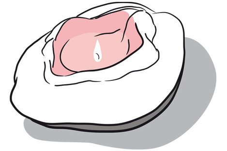
Snippornas afton
My latest illustration job, an interpretation of a designer candle holder. I am so happy the designer liked it!
For those of you in Gothenburg, feel free to attend the venue. I am! :)
http://www.adasweden.se/nyheter/lokalt/snippornas-afton/
For those of you in Gothenburg, feel free to attend the venue. I am! :)
http://www.adasweden.se/nyheter/lokalt/snippornas-afton/
16 November 2010
New work from my artworker/information design course


I have no idea how to get in a good routine when it comes to updating my blog, but getting a Mac Book Pro was certainly a good move. I am not going to promise frequent updates because I am terrible at them, but if I do manage to keep it up give me a pat on the back and a cookie.
This is a two-day quick packaging project we have had (set monday, due wed morning). The goal was to create packaging for "healthy liquorice candy" for people who are 20-40 and health-conscious, product name "Grön Lakritz" (swedish for green liquorice). Part of the assignment was to take apart existing packaging and reproduce it and how it works (the closing mechanism) and then apply our design on it. We also had to make a digital sketch of our product in an environment. I went for a slightly unusual and exclusive feel for the packaging since I chose the product to be organic. I thought a nice detail would to have a fresh green inside in contrast to the dark outside (the green to the right of my packaging design). The illustration is from Wikimedia commons and, alas, is not mine. There is no time to do a drawing of that level of detail in that short amount of time. I think I would need at least a week to complete the project if I were to illustrate it with that kind of detail (and come up with the idea, sketching takes time too).
The photo is taken by David Joyce (Flickr). Thank you David!
Keep you fingers crossed that I manage to find time to post other stuff that I have been doing here. ;)
16 June 2010
Drying time

Having spent a whole day at following Jerlov's print consultant Börje around to look at different printers and printing processes (a big thank you Börje! It was really kind of you to offer me this opportunity) I was left with new insights into things and a mix of surprise and awe at some of the processes in use today.
The processes look much the same as they did at the birth of offset printing and screen printing, hence I recogized just about all the processes as the same as I have done hands-on when I was doing fine-art-printing. It amazing though, how technology has refined and cleaned up the printing industry. Things like using vegetable based inks and a mixture of chalk and sugar to make a thin film that seperates each sheet as it dries in stacks on the pallet. Humidity and air temperature where also really imporant. It is amazing how paper is so sensitive.
Drying times were one thing that really got to and drove home the importance of giving the printers ample time to print things. On uncoated paper the drying time i approx one day. For coated paper it takes approx 2-3 days. And on thicker substrates such as board drying time may be a whole week!
As if that isn't enough I just read an article about the drying time of reflex blue, it amazing that anything gets done on time really:
http://www.paperspecs.com/mainblog/the-reflex-blue-blues/
The photograph shows a print-finishing-line so to speak. The pages are about to be sent along to be glue-bound, attached to a cover, and then trimmed.
28 May 2010
Lovely prints
Prints!
I can't wait to spend some time in my studio and do some art. Seeing this was inspiring:
http://www.stjudesprints.co.uk/
I can't wait to spend some time in my studio and do some art. Seeing this was inspiring:
http://www.stjudesprints.co.uk/
Waterstones new logo

I know it's not new new, but I do really like the colours in their new logo. Lovely.
27 May 2010
The word "royalties" and the glamorous life of an illustrator
Seen in yesterdays (swedish) Metro in the column by Stephan Mendel-Enk. He likes... "Ordet royalties. Att engelskan har samma begrepp för kungligheter och artistisk ersättning gör konstnärslivet glamorösare." Translation: "The word royalties. The fact that, in english, it can both mean royal people and the money you get from artistic endevours makes the artists life just that little bit more more glamourous."
I like his train of thought...!
I like his train of thought...!
26 May 2010
Packaging -- lovely illustration

Lovely use of illustration on packagagng for exclusive handmade chocolate.
http://illustrationweb.blogspot.com/2010/05/yummy-chocolates.html#links
20 May 2010
Om tomtarna på Vasagatan
Found an interesting article about the lovely illustrations on a bulding on Vasagatan. Finally an answer as to who the artist is, suprisingly it is not Carl Larsson or Jenny Nyström. (Sorry everybody who can't read Swedish).
http://www.boplats.se/CM/Templates/Article/general.aspx?cmguid=6893b93b-4c14-4c53-b732-0da9b63c79a1
17 May 2010
Doodles


Today's crop of doodles. (Well actually not today, but they are scanned today) Perhaps they will crop up as future characters or stories...
Open Type, PostScript fonts explained
Confused about the different font formats? I stumbled upon a good page about this:
http://www.creativepro.com/article/typetalk-opening-up-about-opentype
http://www.creativepro.com/article/typetalk-opening-up-about-opentype
Article about Adobe vs Apple and PostScript
Article about Adobe vs Apple.
Ever wondered about True Type and PostScript... well here's the story behind the scenes:
http://www.appleinsider.com/articles/10/05/14/adobe_apple_war_on_flash_reminiscent_of_postscript_struggle.html
Ever wondered about True Type and PostScript... well here's the story behind the scenes:
http://www.appleinsider.com/articles/10/05/14/adobe_apple_war_on_flash_reminiscent_of_postscript_struggle.html
14 May 2010
Paper that I lurves


Realised I should share some of the love. Here are two lovely paper types.
Skin is amazing paper. It feels rubbery and is amazing when paired with spot UV-coating/spot UV-varnish (in swedish: partiell UV-lack). It's made by a company called ArjowWiggins. Map stocks this paper and can actually be bought in small quantities at the lovely store Rum för Papper http://rumforpapper.se/ (there are some lovely inspiring ladies that work there and I always come away with a lot more paper than I intended to buy).
There's a Thai restaurant here in town (Gothenburg, Sweden that is) that has a beautiful example of this spot-UV-coating-on-skin in action on their business cards. Managed to find an image of something similar here: http://www.fastkit.com/Spot-UV-Overall-UV-s/77.htm (see image above).
More about skin:
The other paper i like is actually not really paper, but paper board. The paper family Invercote is great stuff. Great for things like menus or folders -- things that have to open and shut again and again. It also is really good at looking good embossed.
http://products.iggesund.com/ProductInformation.aspx?Profile=en&Product=ICC&status=01123581321345589
If you have a look at this image you can see how nicely it folds. (see above image)
Oh, oh, just one more. I also really like the paper Silverblade. It's apparenly changed name to Claro during 2007:
It seems to be a good workhorse when it comes to being a good carrier for things like illustrations or photography. It has a good neutral whiteness that does the images justice.
Right. All for now. Paper is magical stuff and makes a huge difference.
Back on track

Back on track after a tumultous years worth of stuff going on. My life is still in boxes after my move, but all is well and looks promising and productive. I have had time to visit my friend Lobelia (http://www.lobeliabarker.com/) when she was at the annual Elmia Custom Motor Show 2010 (http://www.custommotorshow.se/). It was an incredible experience and her work looked ace as always.
Quick update: I am half way through becoming a prepress-wiz and am thoroughly enjoying my course. I think being an illustrator and being good at prepress is a powerful combination full of possibilties(!) My fingers are itching... I am also nurturing a more serious than ever addiciton to all kinds of papers. I am even learning the names of some of my favorites. Maybe I should have known this is where I would end up when I started sniffing the binding glue in my books as a kid (I had favorites then too, certain paper-and-glue smells still take me back to primary school and sentences like "the cat sat on the mat").
Currently I am sitting in professional practice at the advertising agency Jerlov and having a wonderful time. So many talented creatives! Very impressed by everbody. Everyone seems to have their own "thing" that they are good at. They are friendly too. I am glad they like my work too.
Lastly I give you today's doodle. A gorilla. He just turned up out of nowhere.
30 December 2009
I've run away...
... to the Carribean, which is part of the reason why I haven't posted anything in ages... (sitting in Old San Juan, Puerto Rico as I type this) I will remedy this end of january when I get back. Watch this space. Merry Christmas and Happy New Year's everyone!
23 June 2009
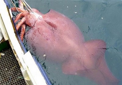
Giant Squid

Hope your summer is going great so far. Mine is! Lots to do as usual.
Here's an image (well, two, one sketch and one cleaned-up drawing) that I am particularly pleased with. It is an artists impression of a deep sea squid. The reason that it is an "artists impression" is that there are very few photographs of deep sea squids. And even if live specimens are caught sometimes they often look terrible (sludgy and deflated) because their bodies are made to exist in the high-pressure zone of deep, deep sea.
It is perhaps going to be reference material for a tattoo hence me using a combined line-and-red-shading style of drawing. I tried to capture the movement of a swimming sea squid based on the fins in this photograph:
http://www.indiastudychannel.com/pictures/gallery/gangarajuchalapathi__73strange%20photos%20bizarre%20sea%20creature%20caught%20part%20squid%20part.jpg
03 June 2009
Roooooooowr!

Excerpt from my sketchbook. Angry, angry, bear. I was just curious as to what makes and angry bear (grizzly) look angry. I mean they have all the cute-assets; little round fluffy ears, little "cute" eyes. i guess it's the HUGE teeth and mouth. The large, nostrils do their bit too.
I am currently returning to the "building blocks" of illustration: sketching and colour theory. I have also been working on my painting skills and feel like I have learnt a lot that I can use in my illustration. Most interesting of all has been the warm/cold colour juxtapositioning of the old masters (won't write about it all here - get in touch if you want to know more).
I have also finally mastered the creating and using my own brushes in Photoshop. Yay! Exciting stuff (for me anyhow). Keep an eye out for results of this in the future. All in all I am very busy with various projects. My layout and InDesign skills have been pushing forwards in leaps and bound because of work on 6-page a CD booklet.
Have a good one, hope you get some sunshine! (Here in Sweden the sun is hardly going down at all)
Subscribe to:
Posts (Atom)