16 June 2010

Drying time


Having spent a whole day at following Jerlov's print consultant Börje around to look at different printers and printing processes (a big thank you Börje! It was really kind of you to offer me this opportunity) I was left with new insights into things and a mix of surprise and awe at some of the processes in use today.

The processes look much the same as they did at the birth of offset printing and screen printing, hence I recogized just about all the processes as the same as I have done hands-on when I was doing fine-art-printing. It amazing though, how technology has refined and cleaned up the printing industry. Things like using vegetable based inks and a mixture of chalk and sugar to make a thin film that seperates each sheet as it dries in stacks on the pallet. Humidity and air temperature where also really imporant. It is amazing how paper is so sensitive.

Drying times were one thing that really got to and drove home the importance of giving the printers ample time to print things. On uncoated paper the drying time i approx one day. For coated paper it takes approx 2-3 days. And on thicker substrates such as board drying time may be a whole week!

As if that isn't enough I just read an article about the drying time of reflex blue, it amazing that anything gets done on time really:

http://www.paperspecs.com/mainblog/the-reflex-blue-blues/

The photograph shows a print-finishing-line so to speak. The pages are about to be sent along to be glue-bound, attached to a cover, and then trimmed.

28 May 2010

Lovely prints

Prints!

I can't wait to spend some time in my studio and do some art. Seeing this was inspiring:

http://www.stjudesprints.co.uk/

Waterstones new logo


I know it's not new new, but I do really like the colours in their new logo. Lovely.

27 May 2010

The word "royalties" and the glamorous life of an illustrator

Seen in yesterdays (swedish) Metro in the column by Stephan Mendel-Enk. He likes... "Ordet royalties. Att engelskan har samma begrepp för kungligheter och artistisk ersättning gör konstnärslivet glamorösare." Translation: "The word royalties. The fact that, in english, it can both mean royal people and the money you get from artistic endevours makes the artists life just that little bit more more glamourous."
I like his train of thought...!

26 May 2010

Packaging -- lovely illustration


Lovely use of illustration on packagagng for exclusive handmade chocolate.

http://illustrationweb.blogspot.com/2010/05/yummy-chocolates.html#links

20 May 2010

Om tomtarna på Vasagatan


Found an interesting article about the lovely illustrations on a bulding on Vasagatan. Finally an answer as to who the artist is, suprisingly it is not Carl Larsson or Jenny Nyström. (Sorry everybody who can't read Swedish).

http://www.boplats.se/CM/Templates/Article/general.aspx?cmguid=6893b93b-4c14-4c53-b732-0da9b63c79a1

17 May 2010

Doodles


Today's crop of doodles. (Well actually not today, but they are scanned today) Perhaps they will crop up as future characters or stories...

Open Type, PostScript fonts explained

Confused about the different font formats? I stumbled upon a good page about this:

http://www.creativepro.com/article/typetalk-opening-up-about-opentype

Article about Adobe vs Apple and PostScript

Article about Adobe vs Apple.
Ever wondered about True Type and PostScript... well here's the story behind the scenes:

http://www.appleinsider.com/articles/10/05/14/adobe_apple_war_on_flash_reminiscent_of_postscript_struggle.html

14 May 2010

Paper that I lurves


Realised I should share some of the love. Here are two lovely paper types.

Skin is amazing paper. It feels rubbery and is amazing when paired with spot UV-coating/spot UV-varnish (in swedish: partiell UV-lack). It's made by a company called ArjowWiggins. Map stocks this paper and can actually be bought in small quantities at the lovely store Rum för Papper http://rumforpapper.se/ (there are some lovely inspiring ladies that work there and I always come away with a lot more paper than I intended to buy).

There's a Thai restaurant here in town (Gothenburg, Sweden that is) that has a beautiful example of this spot-UV-coating-on-skin in action on their business cards. Managed to find an image of something similar here: http://www.fastkit.com/Spot-UV-Overall-UV-s/77.htm (see image above).

More about skin:


The other paper i like is actually not really paper, but paper board. The paper family Invercote is great stuff. Great for things like menus or folders -- things that have to open and shut again and again. It also is really good at looking good embossed.
If you have a look at this image you can see how nicely it folds.
(see above image)


Oh, oh, just one more. I also really like the paper Silverblade. It's apparenly changed name to Claro during 2007:
It seems to be a good workhorse when it comes to being a good carrier for things like illustrations or photography. It has a good neutral whiteness that does the images justice.

Right. All for now. Paper is magical stuff and makes a huge difference.

Back on track


Back on track after a tumultous years worth of stuff going on. My life is still in boxes after my move, but all is well and looks promising and productive. I have had time to visit my friend Lobelia (http://www.lobeliabarker.com/) when she was at the annual Elmia Custom Motor Show 2010 (http://www.custommotorshow.se/). It was an incredible experience and her work looked ace as always.

Quick update: I am half way through becoming a prepress-wiz and am thoroughly enjoying my course. I think being an illustrator and being good at prepress is a powerful combination full of possibilties(!) My fingers are itching... I am also nurturing a more serious than ever addiciton to all kinds of papers. I am even learning the names of some of my favorites. Maybe I should have known this is where I would end up when I started sniffing the binding glue in my books as a kid (I had favorites then too, certain paper-and-glue smells still take me back to primary school and sentences like "the cat sat on the mat").

Currently I am sitting in professional practice at the advertising agency Jerlov and having a wonderful time. So many talented creatives! Very impressed by everbody. Everyone seems to have their own "thing" that they are good at. They are friendly too. I am glad they like my work too.

Lastly I give you today's doodle. A gorilla. He just turned up out of nowhere.


30 December 2009

I've run away...

... to the Carribean, which is part of the reason why I haven't posted anything in ages... (sitting in Old San Juan, Puerto Rico as I type this) I will remedy this end of january when I get back. Watch this space. Merry Christmas and Happy New Year's everyone!

23 June 2009

Giant Squid


Hope your summer is going great so far. Mine is! Lots to do as usual.

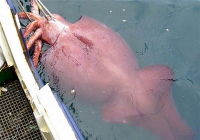
Here's an image (well, two, one sketch and one cleaned-up drawing) that I am particularly pleased with. It is an artists impression of a deep sea squid. The reason that it is an "artists impression" is that there are very few photographs of deep sea squids. And even if live specimens are caught sometimes they often look terrible (sludgy and deflated) because their bodies are made to exist in the high-pressure zone of deep, deep sea.

It is perhaps going to be reference material for a tattoo hence me using a combined line-and-red-shading style of drawing. I tried to capture the movement of a swimming sea squid based on the fins in this photograph:
http://www.indiastudychannel.com/pictures/gallery/gangarajuchalapathi__73strange%20photos%20bizarre%20sea%20creature%20caught%20part%20squid%20part.jpg

03 June 2009

Roooooooowr!


Excerpt from my sketchbook. Angry, angry, bear. I was just curious as to what makes and angry bear (grizzly) look angry. I mean they have all the cute-assets; little round fluffy ears, little "cute" eyes. i guess it's the HUGE teeth and mouth. The large, nostrils do their bit too.

I am currently returning to the "building blocks" of illustration: sketching and colour theory. I have also been working on my painting skills and feel like I have learnt a lot that I can use in my illustration. Most interesting of all has been the warm/cold colour juxtapositioning of the old masters (won't write about it all here - get in touch if you want to know more).

I have also finally mastered the creating and using my own brushes in Photoshop. Yay! Exciting stuff (for me anyhow). Keep an eye out for results of this in the future. All in all I am very busy with various projects. My layout and InDesign skills have been pushing forwards in leaps and bound because of work on 6-page a CD booklet.

Have a good one, hope you get some sunshine! (Here in Sweden the sun is hardly going down at all)

06 May 2009

Blue tongued skink: dipping pen drawing-and-text


Posting an image from my sketchbook. One of a series of images where I have paid attention the the relationship between text and image.

I have also started experimenting working with oil paint which is marvelous fun and I hope to post the results sometime soon.

I am also hoping to figure out how to do art with a positive, celebratory slant on things. If you have any ideas feel free to share them with me. I have been thinking a lot about how art is often a crticism of something -- which is fine -- but I feel like I want to avoid criticising without a solution/example of something better, or even better just celebrate good things already happening. I feel as if it is all too easy to find something in the world that isn't right or open to criticism. It is nice if criticism is weighted more towards a solution, or even better celebrates something good. A nice example of what I think is a good example of "positive" art that really is quite moving is the "Where the Hell is Matt?" video: www.wherethehellismatt.com

08 April 2009

Awful news: Illustrator wrongly accused

http://www.jonengle.com.nyud.net/2009/04/accused/

What an incredible nightmare of a situation! Proof that illustrators really need to be careful with their work and keep a close record of all images(!) Goodness, who would ever have dreamt of being sued for plaigarism of your own work?!

21 March 2009

Noch asleep


A little late-night sketch of my dog lying at my feet. When one of us is away the dog gets to sleep on the bed all night which he loves (when we're both home he finds it too squashy on the bed and prefers his bed on the floor next to us!). I love sleeping animals, they look so peaceful and content. I wanted to capture that in this sketch.

20 March 2009

Imaginary Animal Doodle


Just wanted to share an animal doodle I was doing between coding CSS for my new homepage. This is one of those imaginary beasts that are almost therapeutic for me to sketch. Yes folks, this is how I started out drawing -- doodling imaginary animals and monsters everywhere. They are basically a jumble of different real animals that I have at some point drawn studies of. One fine day the co-illustrated fantasy monster themed book will become reality.

19 March 2009

Going back to dipping pen


Ahhh today has been a nice but slightly frustrating day. I am completely redoing my homepage and am very excited about applying my hard-earned XHTML and CSS skills. Once I am done my homepage will be a breeze to update *yay*. So what is the frustrating bit you ask? Well if you know anything about HTML and CSS it's the fiddling with positioning and getting the boxes to line up the way you want them to and keeping you div tags in line! One typo somewhere and you have boxes floating all over the place (haha -- yes, pun/in-joke inteneded).

Recently I was browsing the web getting distracted when I stumbled upon Jill Calder's blog (one of my tutors when I studied at the Edinburgh College of Art) and read her excellent interview. Great inspiring stuff for illustrators to read:
http://jillustration.blogspot.com/2009/01/interview-by-anna-violet.html
(Caps Lock warning: she btw apologises in advance for leaving Caps Lock on by mistake)

About the image I have posted -- I revisited using a dipping pen since I came across it whilest unpacking (yes, our house is still a big mess in boxes). I am also trying some new Photoshop brushes thanks to a setting I hadn't thought of using to it's full capacity before. Quite pleased with the result. Not sure if the person is an angel or just a person -- but I just wanted to try to see if I could get that feeling of stretching out in some quick few strokes.

03 March 2009

R.I.P. my warm light bulb


I for all saving the environment, but with the news of the EU banning the old light bulbs come September first reaching my ears I can't help but feel a little sad. Of course I am happy for the energy and emissions saved. A little less happy about about the mercury in the energy efficient ones. And really quite sad about not being able to have my old desk lamp filled with the warm glow of a 60W lightbulb. I will truly miss the 95% of the energy being used to light a normal lightlbulb going to heat my cold illustrator hands on a wintery day. But of course this heat is wasteful so it just has to go. I just hope they make energy saving bulbs with a warmer glow... (I find they cast a more greenish blue light)...

http://redgreenandblue.org/2008/10/11/eu-bans-incandescent-light-bulbs/